Van Dieman’s - Kay Cottee
Van Dieman’s - Kay Cottee, swatched on a Col-O-Ring swatch card (design is a Yoseka Stationery stamp).
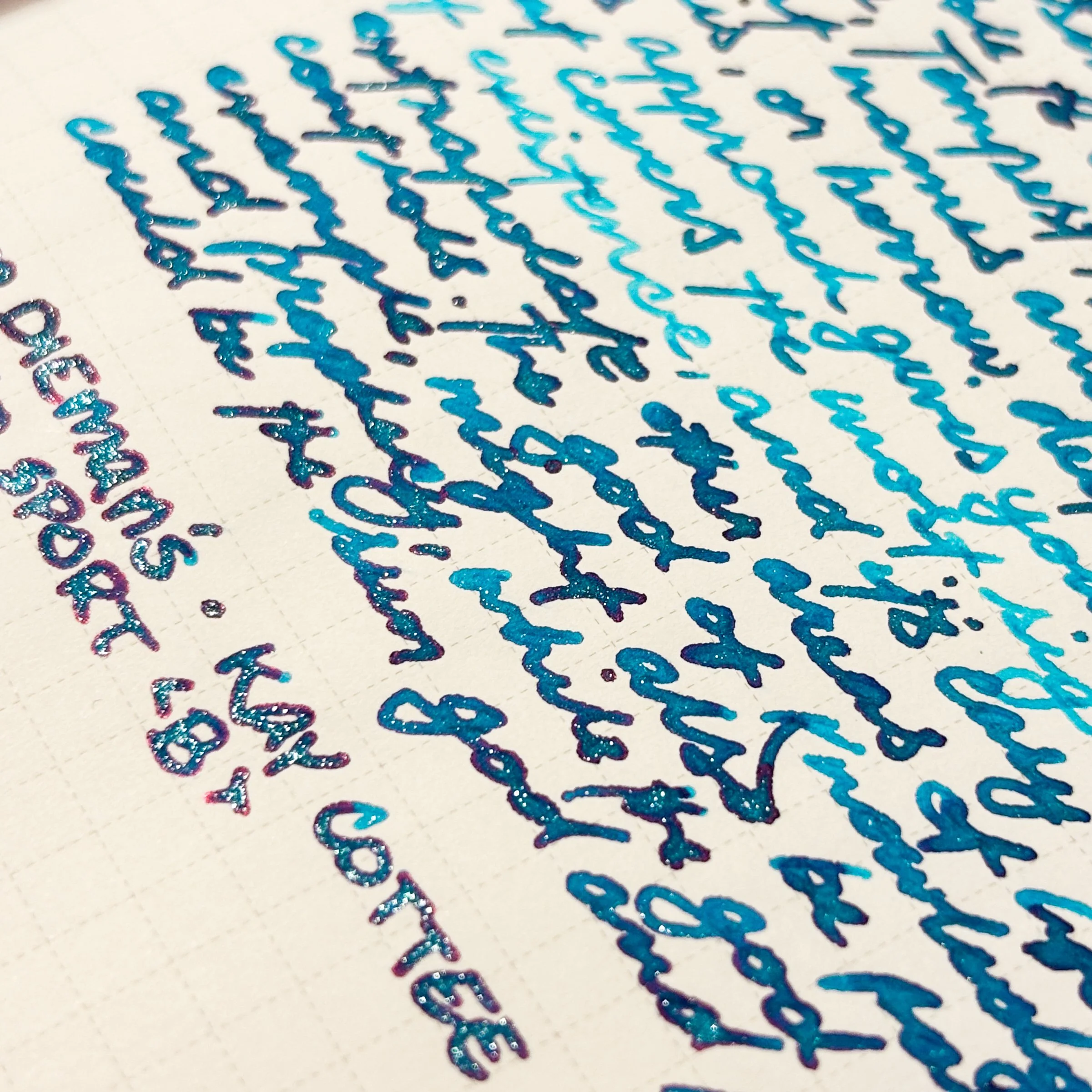
Kay Cottee from Van Dieman’s is so pretty—I love how the mix of the pinky-red sheen, and the beautiful light blue/silvery shimmer. There’s also SHADING in the writing, which as you may have seen is a huge favourite for me.
I found the ink to be similar to FWP Tumbling Time Blue (though Kay Cottee is brighter), and the aggressive amount of reflective shimmer you can seen in the Kokuyo or Rhodia paper is similar to Diamine Blizzard.
Ink Swatches
Writing Sample / Ink Review
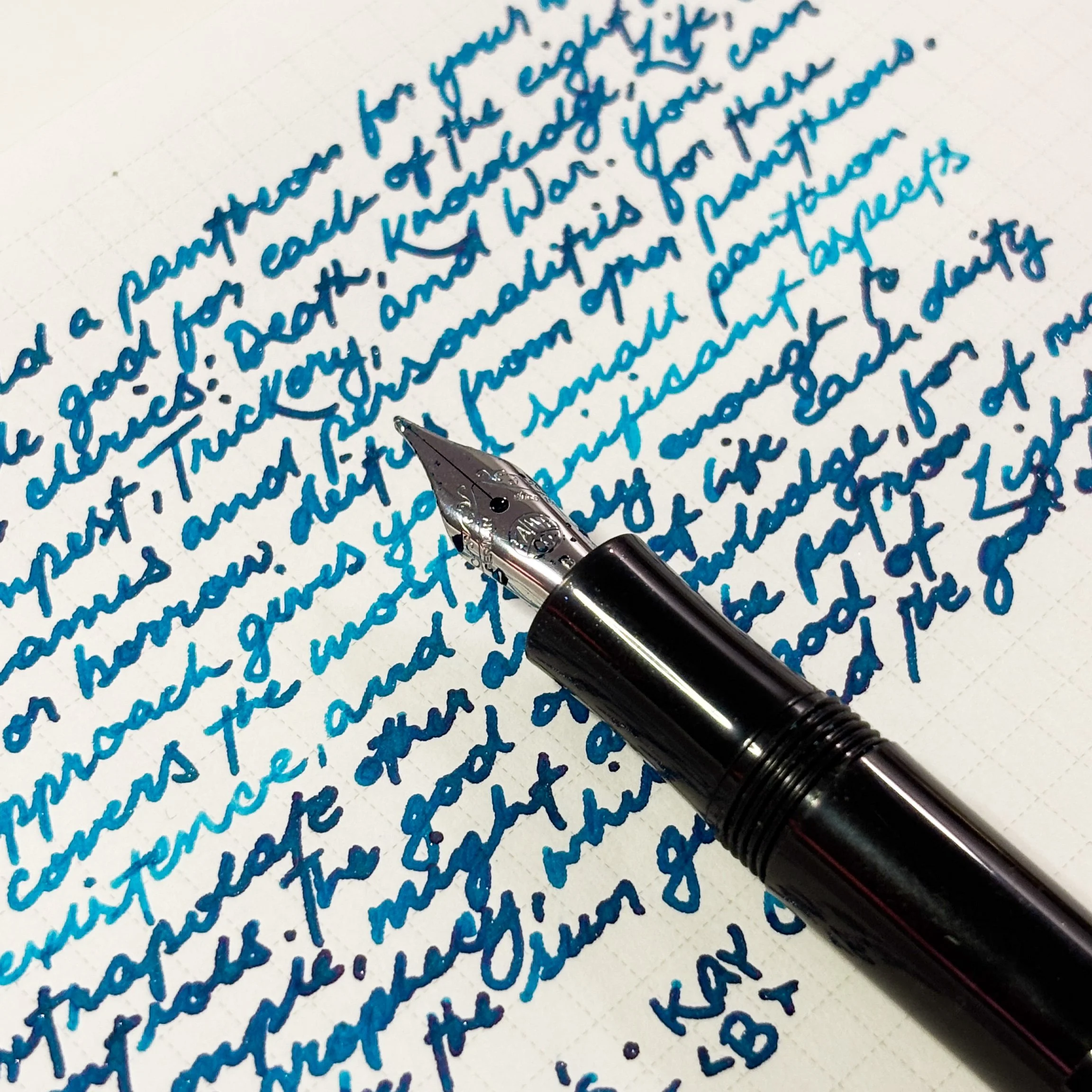
The writing sample here is done with a Kaweco Sport with a broad nib.
This is quite a beautiful ink. I’m a huge fan of seeing that colouring and shimmer (especially in the all-caps writing). It clogged my Kaweco for a bit, which I thought was very surprising. Maybe it’s the size of the shimmer? Either way, I used a brass shim to clear out some shimmer and it worked lovely afterwards.
I’ll use up my sample and see if it’s likely to clog my other pens (it might have just been my Kaweco acting up).
Hi! Just a disclaimer that:
I bought this ink as part of the Penablers 2024 Advent Calender!
If you'd like to support me and have some stationery shopping to do, check out the Atlas Stationer's site using my affiliate link, and use code PAPEREMM10 for 10% off your cart!


Triple whammy—a medium blue shimmer with reddish sheen, blueish shimmer, and shading!